

Visual Identity, Logo, Brand Guide, Poster Design, Merch
SERVICES
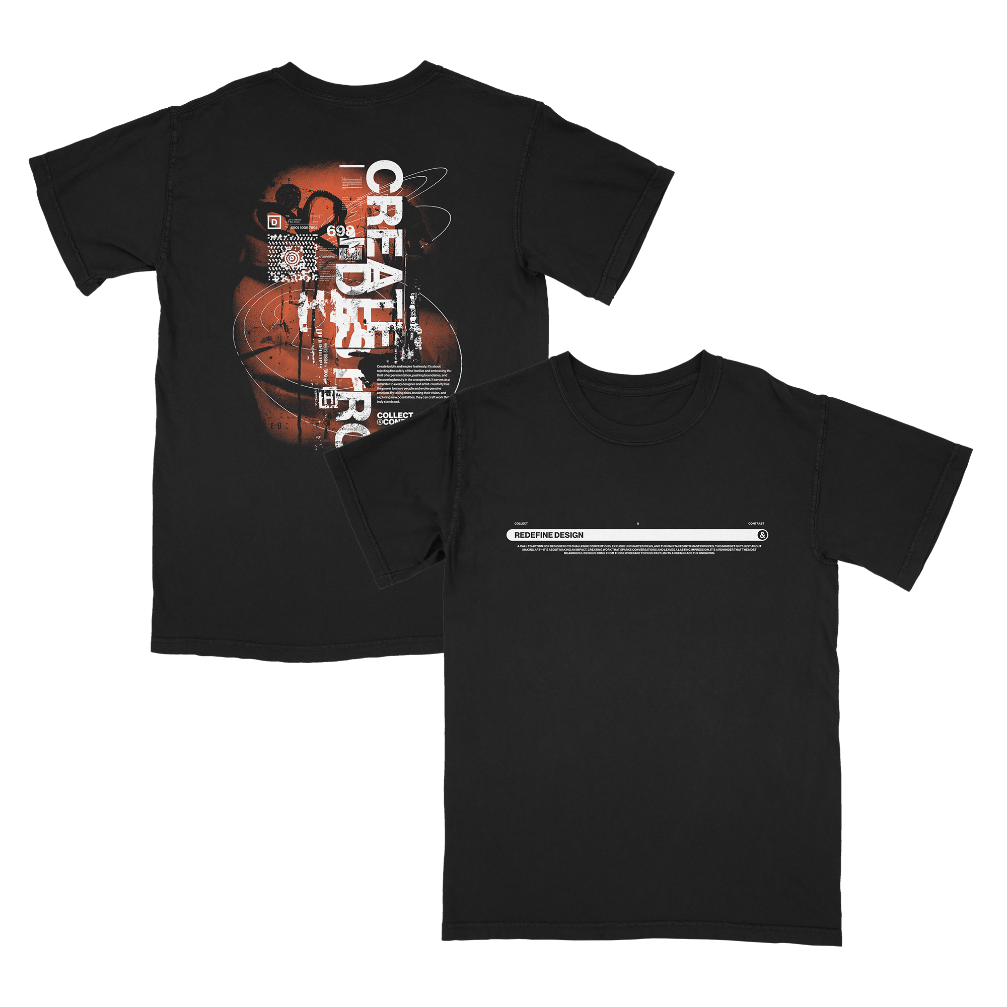
Collect & Contrast Visual Identity
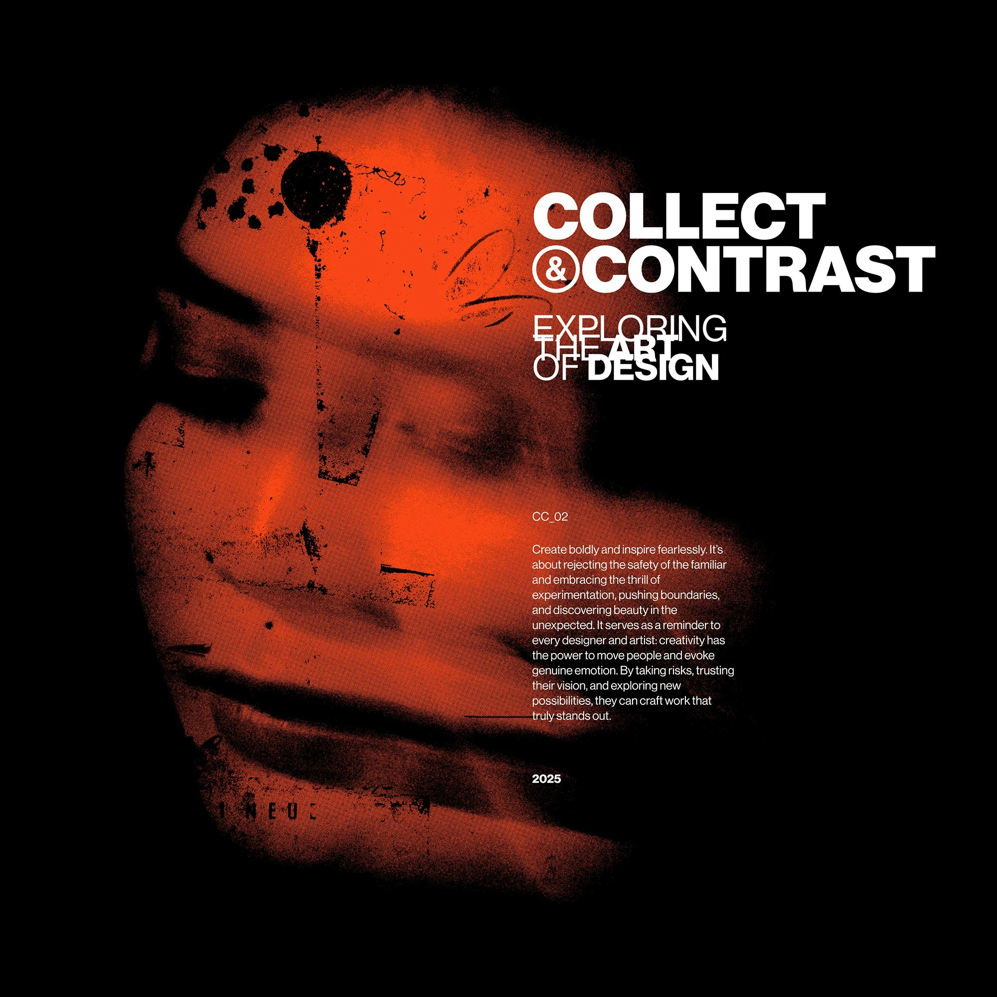
Over two years, Collect and Contrast has evolved from a channel focused on collage design to a broader exploration of graphic design, creative processes, and pushing the boundaries of the craft. This rebrand was born from the desire to align the channel's identity with its new direction—a space where experimentation meets professionalism, inspiring designers to be bold and innovative. The project aims to create a versatile, clean brand that reflects a creative vision while being adaptable across various platforms, showcasing the channel’s growth and future potential.

BEFORE
AFTER
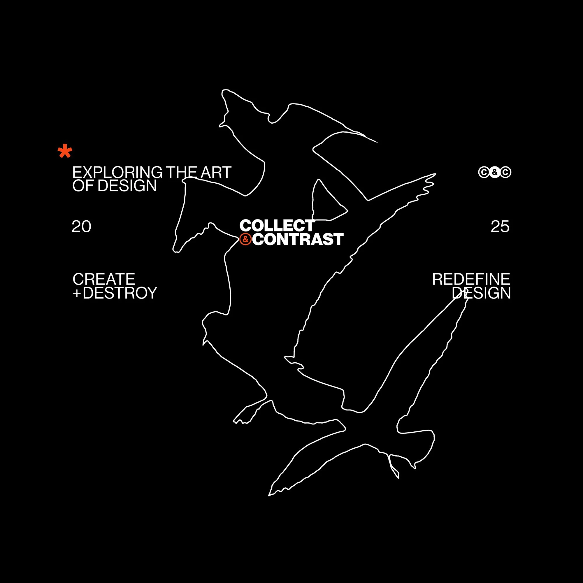
ADAPTABLE LOGO SYSTEM
It’s hard to predict how logos will need to be used or where they’ll end up. To make sure that the brand stays consistent in every scenario, a robust system has been made to ensure there’s an official option for any and every situation.


THE APPROACH
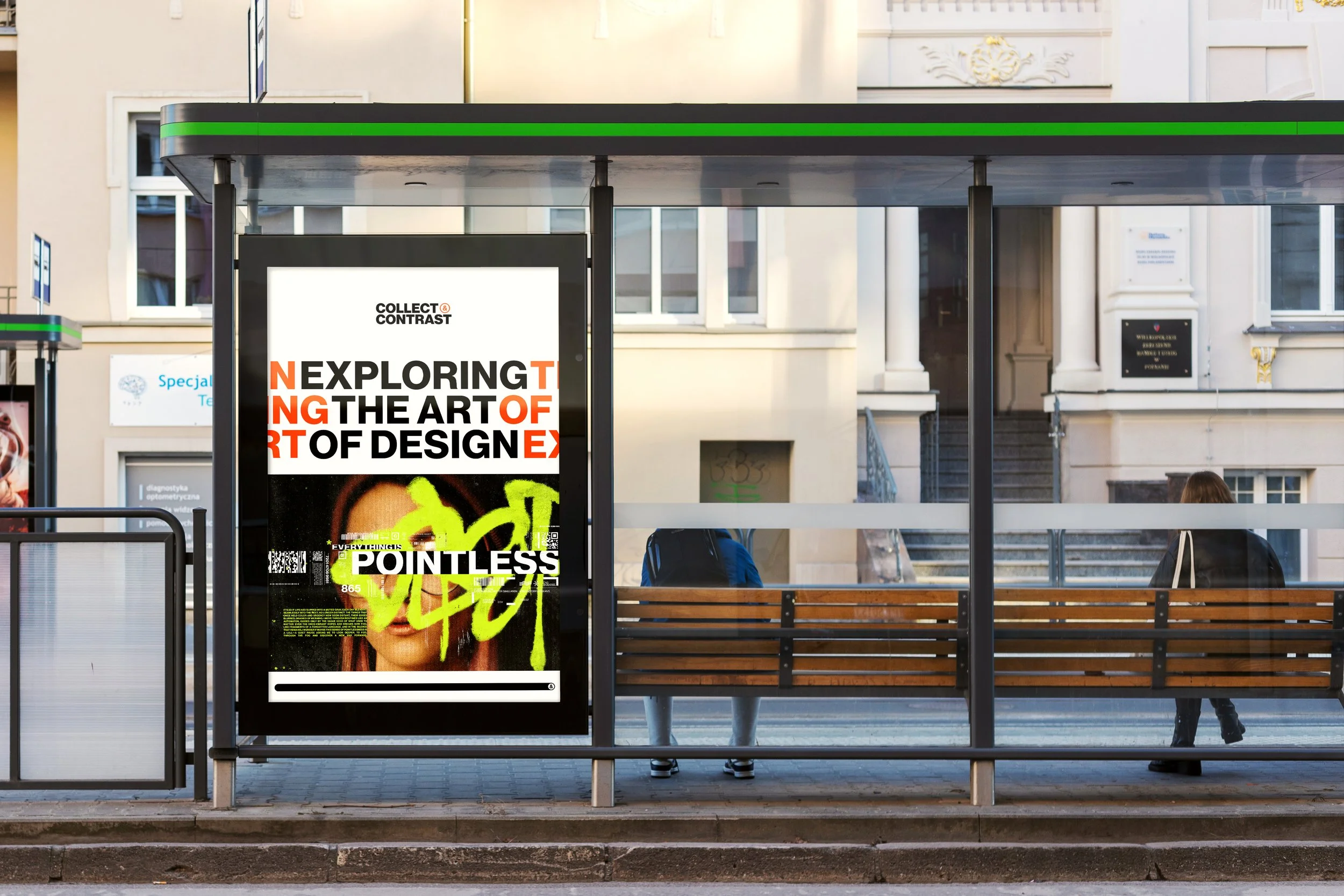
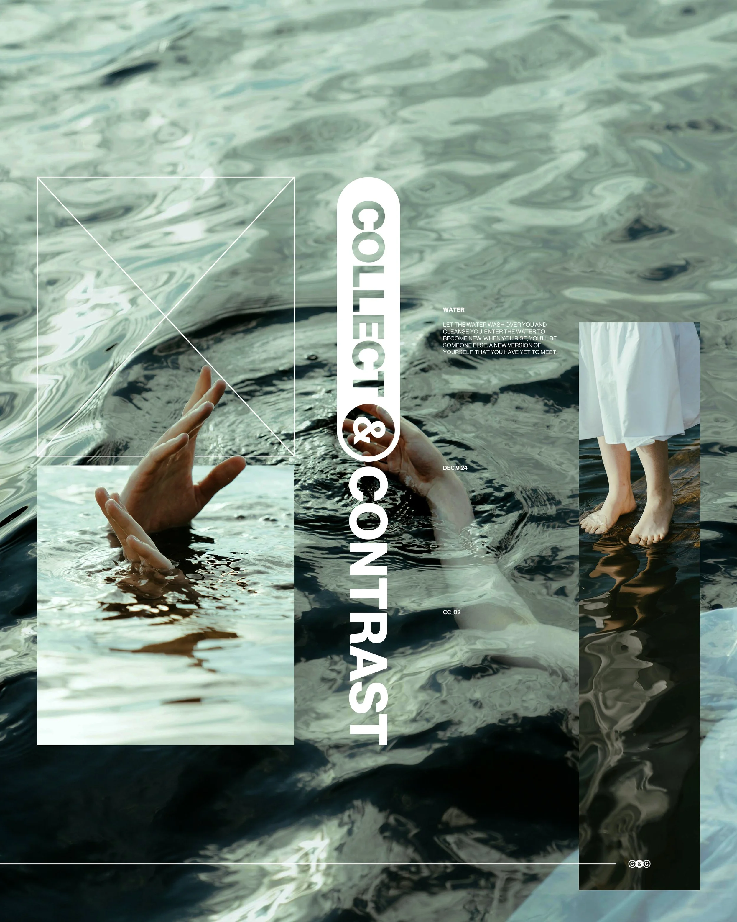
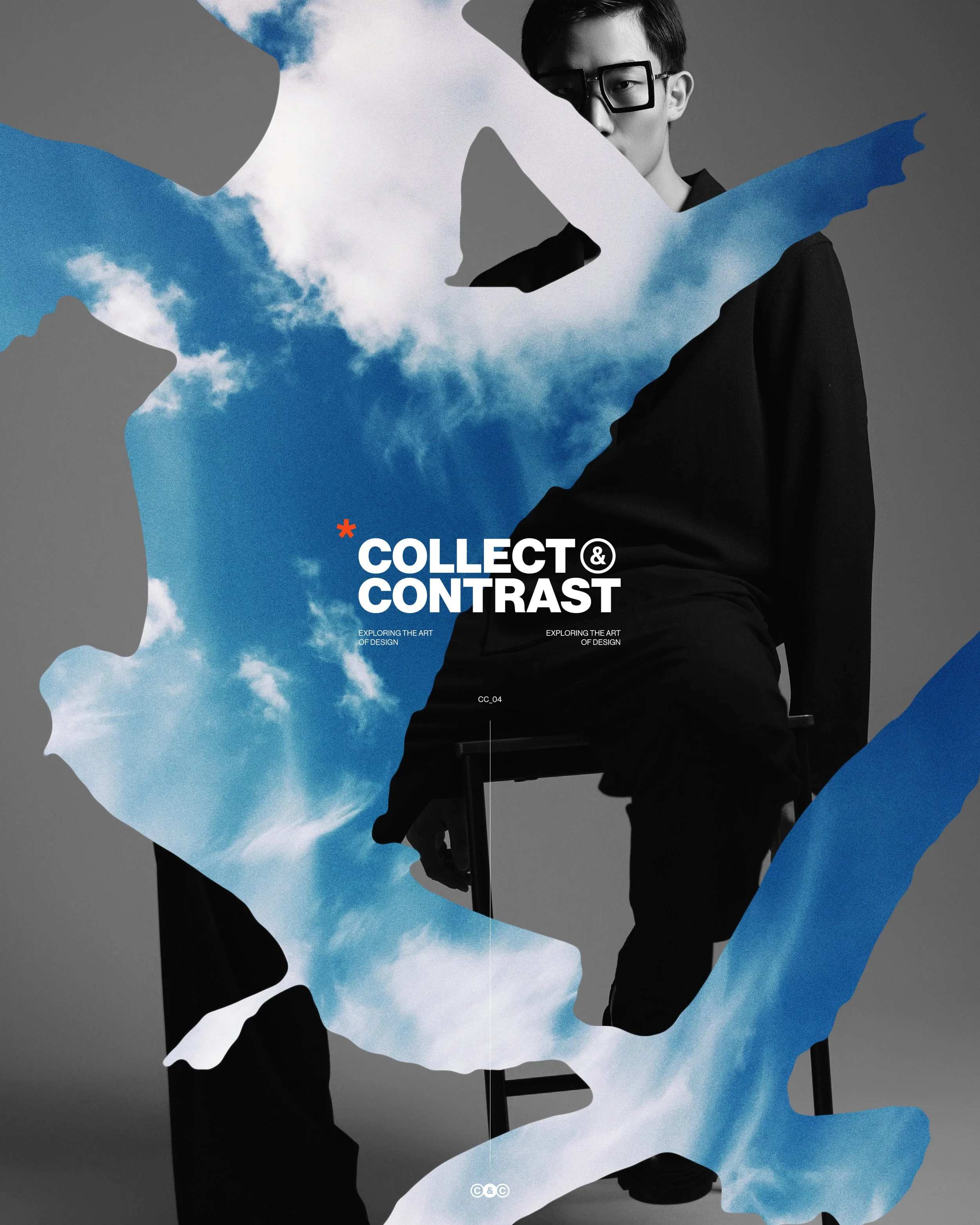
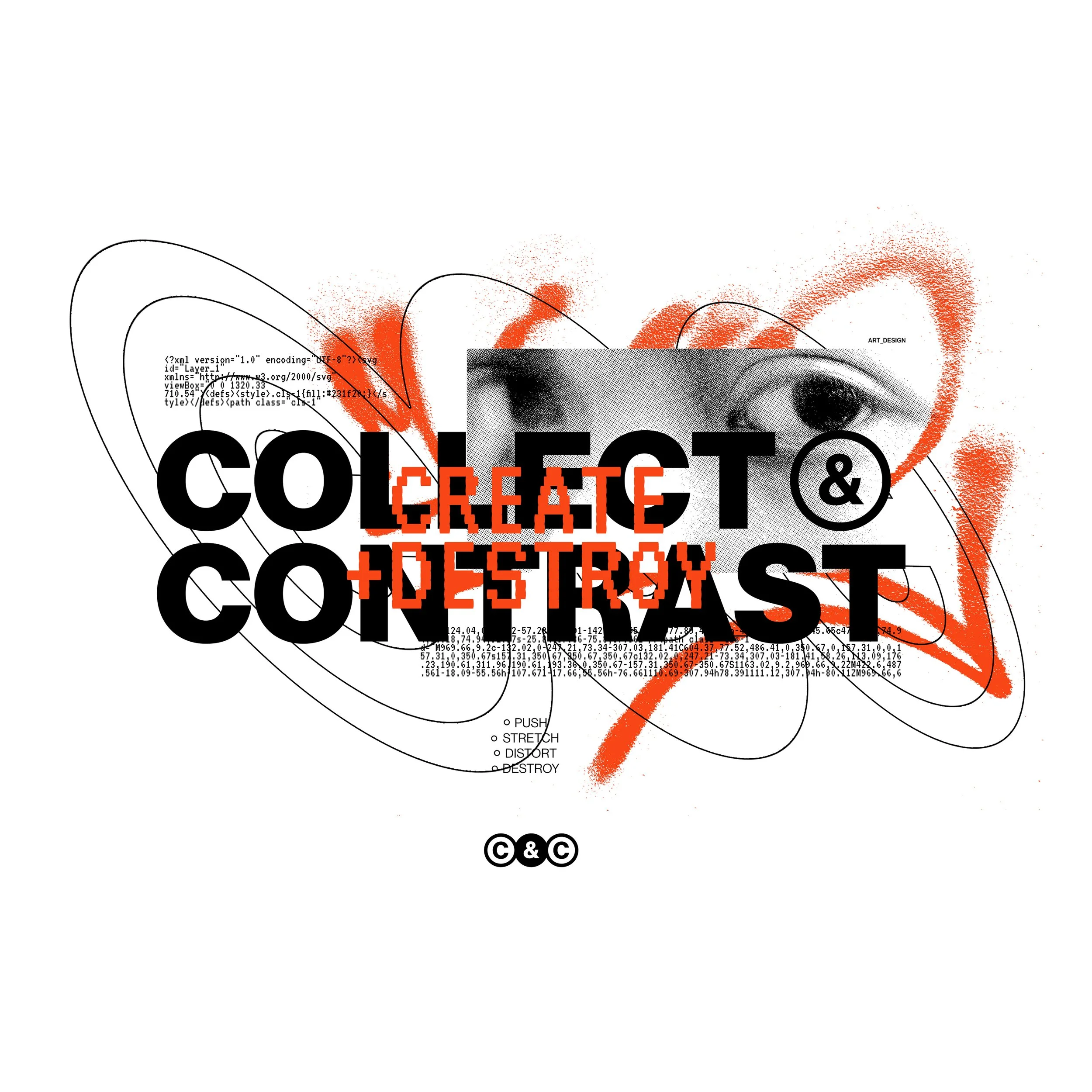
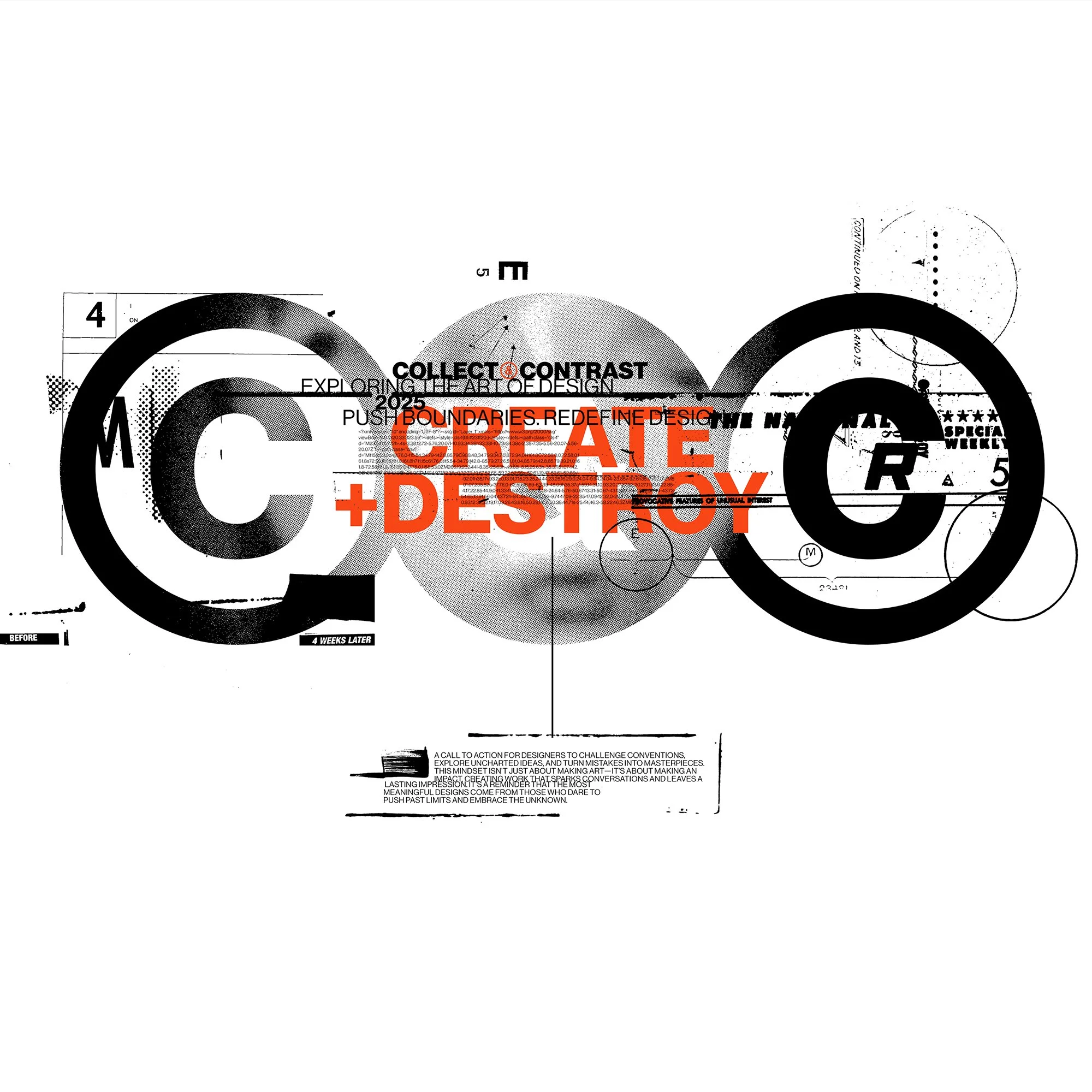
The approach for this rebrand wasn’t about discarding what came before but refining it to align with the channel’s evolving goals and creative direction. The aim was to craft an identity that seamlessly integrates with a variety of design styles — whether it’s a clean Swiss poster, gritty grunge design, or a chaotic collage. This adaptability ensures the identity works across different contexts without losing its essence.
At the same time, the identity draws inspiration from these styles, incorporating their defining elements to create something that feels both creative and distinctive. It’s not just flexible — it’s grounded in its own inspirations, serving as an amalgamation of the diverse design styles and interests that define Collect & Contrast. This balance allows the identity to stand on its own while remaining versatile enough to evolve with the channel’s future.
BRAND GUIDE


CUSTOM MOTION GRAPHICS

THE OUTCOME
The outcome of the Collect and Contrast rebrand is a cohesive and versatile visual identity that balances creativity with professionalism. The new branding reflects the channel’s evolution, embracing its focus on experimentation, bold design, and inspiring the creative community. The rebrand not only reinforces the channel’s purpose but also positions it for future opportunities, creating a solid foundation to connect with a broader audience, attract collaborations, and continue pushing the boundaries of design.

CMMA Visual Identity
Visual Identity, Logo

Skullcandy Feel The Sound Campaign
Advertising/Marketing Campaign

Censor Visual Identity
Visual Identity, Logo
